Bright Applications of Color
In the recent weeks as I've been preparing for a bright color landscape class, I've been testing out my own color usage and have been experimenting with new ways to see color in art.

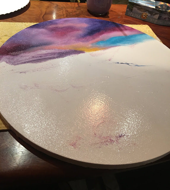


One of the projects along the way was using a thin layer of Golden's OPEN Acrylic Matte Medium as a "liquid clear" (so to speak) before applying acrylic to the canvas. I used a Fredrix round canvas as a test and a photo I found of a beautiful landscape in Iceland.
I mapped out my colors first doing color swatches on canvas paper, and also did an example on the right of most color mixes as to why using black is not the best idea for tinting colors darker. Generally Van Dyke Brown and Paynes Gray, or even Prussian Blue, are far better to use for shadows and darkening colors.

The left side of the color chart is brighter colors for highlighting, whereas the right is general mixing but with white to lighten on the left side of the blends and black to darken on the right (which shows that black isn't always the best option for mixing darker colors).

Here is the thin application of the Golden OPEN Matte Medium

This is the painting almost at completion. The nice thing about acrylic is you can go in to complete your painting later after it is dry (Golden's OPEN line tends to take a few hours to dry, so it gives more blending time).
OPEN is an excellent alternative to those with allergies to solvents and oil mediums, though it does differ from oil in its blending and how it reacts over a layer of the OPEN medium. It does take some getting used to because it has a different viscosity, but I found it fun and easy to work with after I figured out the quirks of the product. Whereas it's not going to be exactly like oil, both oil and acrylic have their own benefits and are wonderful in their own ways. (For more details on my first run with the OPEN Acrylic Medium, please see THIS blog post.)
I recently decided to apply more of an "adventurous" take on my palette to my recent oil paintings and have not been disappointed. I've been using Persian Rose by Williamsburg, Grumbacher's Napthol Red, and Gamblin's Radiant Color line.

This landscape was done with Galkyd Gel and Cold Wax Medium (my current favorite mediums), but the colors were an experiement from my leftover palette from a different painting. I used Naples Yellow, Persian Rose, Burnt Umber, Sevres Blue, and Radiant Green predominately.

A portrait of my partner, done mostly with Gamblin and Williamsburg.
As always, thanks for looking. Have a beautiful week of painting and please always remember to check out Golden and Gamblin's pages for any information on pigments and usage of their products.


Comments
Post a Comment